Datadog is an awesome sofware-as-a-service where you can aggregate and visualize statsd metrics sent from an application. For visualizing timings you create a time series graph. It can look something like this:
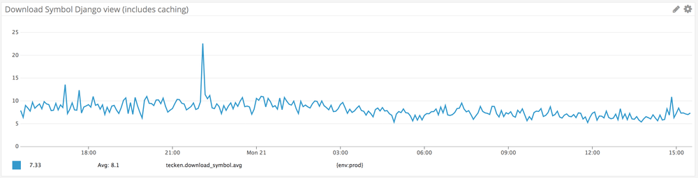
This time series looks sane because because it's timings made very very frequently. But what if it happens very rarely. Like once a day. Then, the graph doesn't look very useful. See this example:
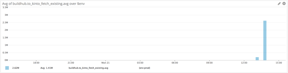
Not only is it happening rarely, the amount of seconds is really quite hard to parse. I.e. what's 2.6 million milliseconds (answer is approximately 45 minutes). So to solve that I used the Datadog API. Now I can get a metric of every single point in milliseconds and I can make a little data table with human-readable dates and times.
The end result looks something like this:
SCOPE: ENV:PROD
+-------------------------+------------------------+-----------------------+
|          WHEN           |        TIME AGO        |       TIME TOOK       |
+=========================+========================+=======================+
| Mon 2018-05-21T17:00:00 | 2 hours 43 minutes ago | 23 minutes 32 seconds |
+-------------------------+------------------------+-----------------------+
| Sun 2018-05-20T17:00:00 | 1 day 2 hours ago      | 20 seconds            |
+-------------------------+------------------------+-----------------------+
| Sat 2018-05-19T17:00:00 | 2 days 2 hours ago     | 20 seconds            |
+-------------------------+------------------------+-----------------------+
| Fri 2018-05-18T17:00:00 | 3 days 2 hours ago     | 2 minutes 24 seconds  |
+-------------------------+------------------------+-----------------------+
| Wed 2018-05-16T20:00:00 | 4 days 23 hours ago    | 38 minutes 38 seconds |
+-------------------------+------------------------+-----------------------+
It's not gorgeous and there are a lot of caveats but it's at least really easy to read. See the metrics.py code here.
I don't think you can run this code since you don't have the same (hardcoded) metrics but hopefully it can serve as an example to whet your appetite.
What I'm going to do next, if I have time, is to run this as a Flask app instead that outputs a HTML table on a Herokup app or something.
Comments
Hey Peter! That sounds exciting! The CONTENTCACHE images are not showing here tho :/
I'd love to see it! :]
Thanks for pointing that out. I've fixed that now.